How to Use Our Logos
Understand how to use the "Block A" logo consistently and accurately, so that you can help amplify the visibility of the University of Arizona's brand and allow the good work we do to resonate throughout all our endeavors.
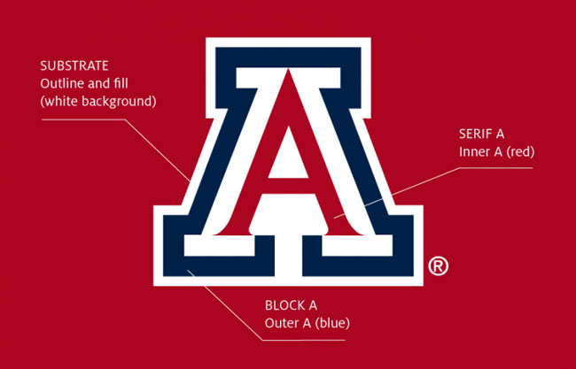
Anatomy of the "A" Our logo is red, white and blue

Quick guide to the construction of the "Block A" logo:
- The “A” can be any size above the minimum, but must not be otherwise altered in any way. This logo is a federally registered trademark.
- Serif “A” must always be the darkest element.
- Marks may not be reversed out on dark backgrounds. They may only be used in the ways shown above.
- Use the correct red and blue: UArizona Red and Arizona Blue definitions may be found here.
- Use the process color mix for reproducing the “A” logo as a 4-color (CMYK) print.
- The “A” should not be screened.
- The “A” may never be overlapped by other marks or images.
- Variations of the “A” will not be accepted.
- When appearing on a color/dark/clear (glass) background, the “A” must include the solid white substrate. Clear background (glass) is equivalent to a color/dark background.
- The substrate of the “A” should be opaque. No other color, pattern or background image should be visible.
- “A” may never be used as part of a word to represent the letter.
- The only two color combination use of the “A” is UArizona Red and Arizona Blue (as shown above).
- The “Block A” may never be added to another graphic, it must always stand alone.
"Block A" and "The University of Arizona"
The "Block A" icon above is combined with the name of the University in balanced spatial relationships that should not be altered. To prevent market confusion with our near competitors, use the logos with the full name of the University, horizontal or vertical, for advertisements, print materials and anything that may be distributed outside Southern Arizona or the Tucson main campus direct area, unless you are using your unit logo. The apparel version, with simply "Arizona," should only be used in extremely tight areas, or as its name implies, on shirts when the printing is small or you believe the usage will be very limited.
Minimum Sizes
To maintain full legibility, never reproduce the logos at sizes smaller than those listed below. These minimum sizes are meant for 300 dpi, high-quality printing. If you are printing on a t-shirt, a newspaper or even with an inkjet printer, keep an eye on the integrity of the pointed tips inside the mark and on the text (the serifs). If these disappear or become fuzzy, increase the size of the logo.

Control or Clear Space
Clear space must surround all UArizona logos (including unit logos) to ensure legibility and prominence. The size of the clear space around all logos must be at least the width of the top blue bar of the "Block A."

The Trademark Symbol
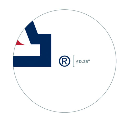
Be sure the trademark symbol is visible as an integral part of the logo on all your pieces. When enlarging any of the UArizona logos for print, product or banner applications, the circle-R symbol should not be larger than 0.25 inch. This will require a manual adjustment.

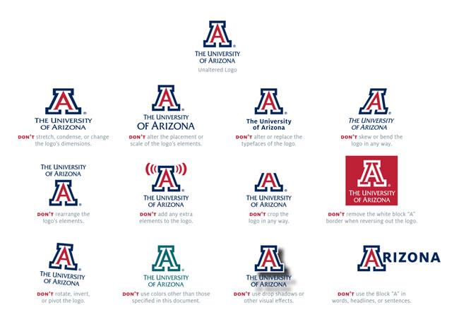
Practices to Avoid
These standards apply to all official UArizona logos and logo versions as described in these guidelines. The set of examples shown here does not include all noncompliant possibilities. Always use unaltered logos.
