Laying Your Layout
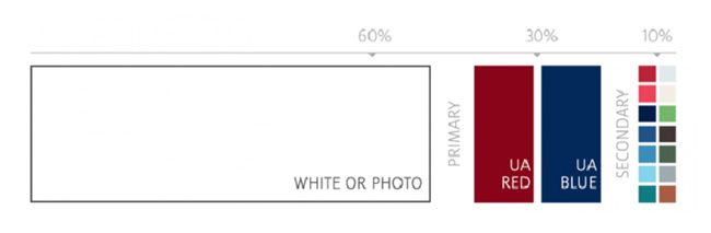
The University of Arizona brand celebrates wide-open spaces, skies, attitudes and thinking. Putting together one or two U of A graphical elements with open space, great photography, U of A Red and Arizona Blue, will strengthen our brand.
Open Space
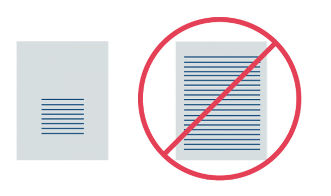
Open space (also referred to as white or negative space) is essential to successful design and message comprehension and is clearly aligned with the University’s brand essence (openness, progress). Use white, light flood colors and bright, wide-open spaces on a page to reinforce the sense of place, open space and limitless possibilities.
Often misconstrued as a literal white space, white/open space could be an image or a light flood color from the U of A palette. Open space also includes margins, gutters and space between columns, lines of type, graphics, figures and objects. Regardless of the form open space takes, use this tool to keep layouts uncluttered, encourage concise copy and focus the viewer’s attention.
How to use it:
- Generally speaking, 60-70 percent of a design/layout should be open space.
- Remove extraneous graphic elements to create breathing room.
- Decrease text by rephrasing it to be more concise.
- If content cannot be reduced, increase the size or length of your materials — add pages or increase the dimensions of the handout.
- Find and use photos with fewer objects and more open space.
What not to do:
- A design that is crowded or cluttered — that is, lacks open space — is not inviting to the viewer.
- Without enough open space, hierarchy is jeopardized; the eye is overwhelmed. The viewer does not know where to look and the eye has nowhere to rest.
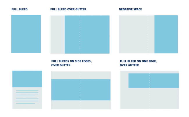
"Boundless" or Bleed Edge
Extending photos or color off the edge of the piece evokes our desert’s feeling of vast openness and our institution’s limitless possibilities. In print this is called a "bleed."
How to use it:
- Extend the image’s edge off of the page or across the gutter to make photography the primary brand element that drives the content of your piece.
- Expand one or more of the edges or combine the boundless edge with open space for added impact.
- Use the Boundless Edge whenever a project allows it. Professionally printed documents are ideal for the Boundless Edge. Documents printed in-house must be printed on larger paper and trimmed down for this technique to work.
We recognize that in-house printing may not be the ideal execution for this technique.
What not to do:
- Do not contain an image on three sides unnecessarily. Instead bleed off the edges of all sides whenever possible.
- Do not box images into borders our outlines to try to show more than one piece will effectively convey. One large image is always preferred over several inset images.