Our Color Palette
Beyond our logo, color is the most recognizable aspect of our brand identity. These colors reflect our heritage, our pride and our location in downtown Phoenix.
Our brand standards include a primary color palette and a secondary color palette. Alongside our palettes, the color white, which could be considered white space or open space, should equally be prominent in our designs. The use of white and leaving open space in design reinforces our sense of place and space, and presents limitless possibilities.
Use these colors sparingly, and appropriately, to make sure our materials are cohesive with the University of Arizona brand.
Primary Color Palette
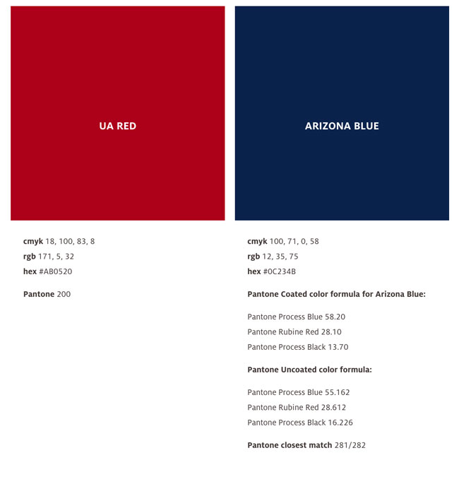
U of A Red and Arizona Blue are our main brand colors. U of A Red (PMS 200 C) is similar to the crimson colored red dye extracted from the cochineal, an insect that lives on prickly pear cactus. Indigenous tribes of Arizona have dyed cloth with cochineal for over 200 years. Arizona Blue has been formulated by Pantone for our reserved use.
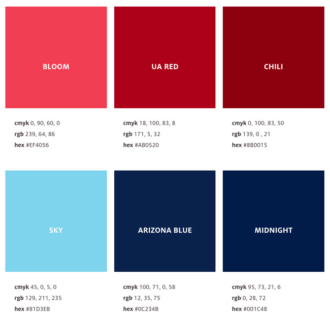
To create additional flexibility, we have complimentary highlight and shadow accent colors for both U of A Red and Arizona Blue. The highlight colors have energy and excitement to match the U of A’s drive towards the future and the shadows provide rich support to the U of A Red and Arizona Blue.
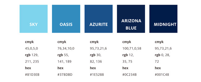
Two more blues are included in our palette to provide a bridge between Arizona Blue and its highlight. This allows designers the flexibility to create materials that predominantly use our primary colors and their extensions (highlight through shadow colors).
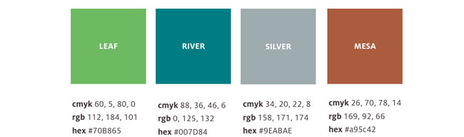
Neutral Colors
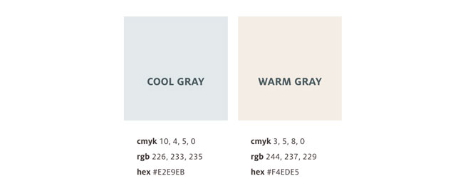
Cool and warm grays can be used as color backgrounds that still allow for neutral open space.
Secondary Color Palette
The secondary palette represents various aspects of the Sonoran Desert, as well as our youthful energy and diversity. Composed of vibrant colors that are refreshing and bold, these colors should be used sparingly as accents and never applied as a color background or pattern. The overall color scheme of any design should not be centered around any of these colors.